Please note: this case study is in development. For more details please reach out.
General Task — 2022
At General Task our goal was to develop tools that made software engineers more productive. After speaking with dozens engineers, a pattern emerged: the modern development tech stack inundated engineers with constant context switching, decision paralysis, and unsure of what truly matters. We realized in the fast-paced world of startups, time and focus is often misdirected.
We built a web-based productivity tool designed with our end-users in mind: software engineers. By integrating with popular project management tools in one surface, exposing user's daily calendar, we gave users a holistic view of their workload while integrating other popular engineering tools into one place.
My role
I led the redesign the product's new home page. This project was shaped by a mixture of activties that I helped to facilitate including conducting user research, usability tests, rapid iteration, and many brainstorms with product management and engineering.
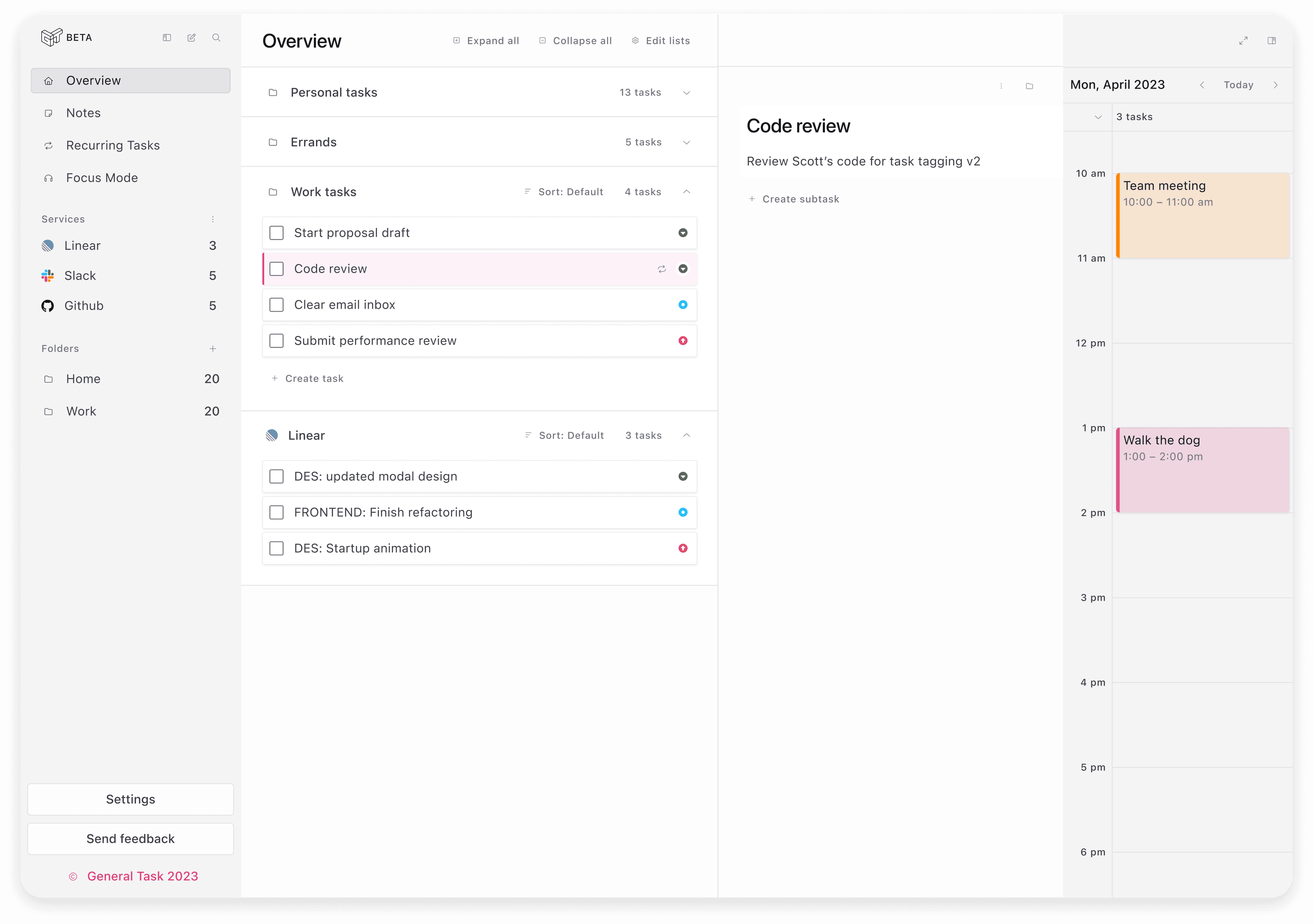
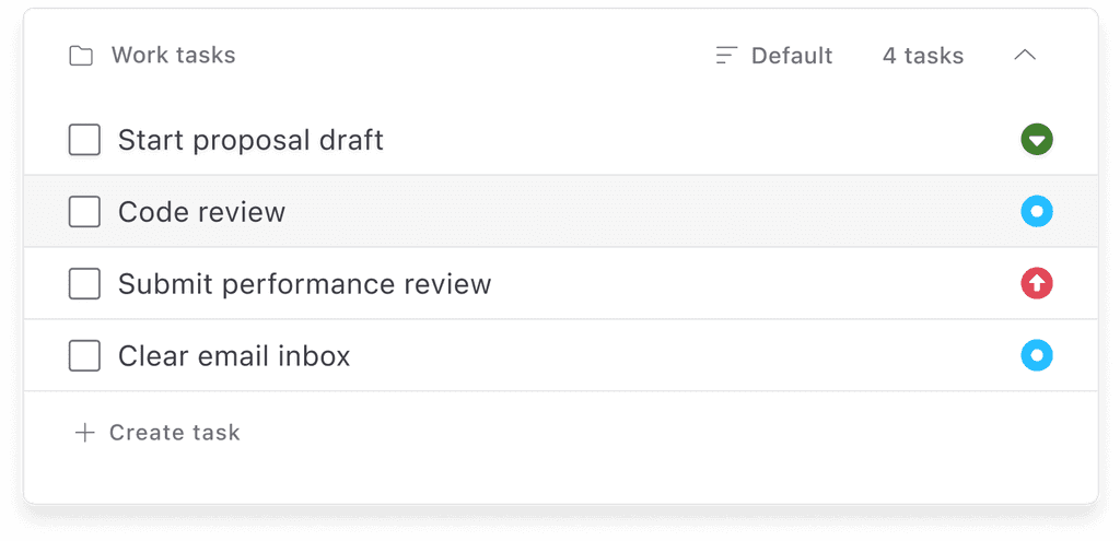

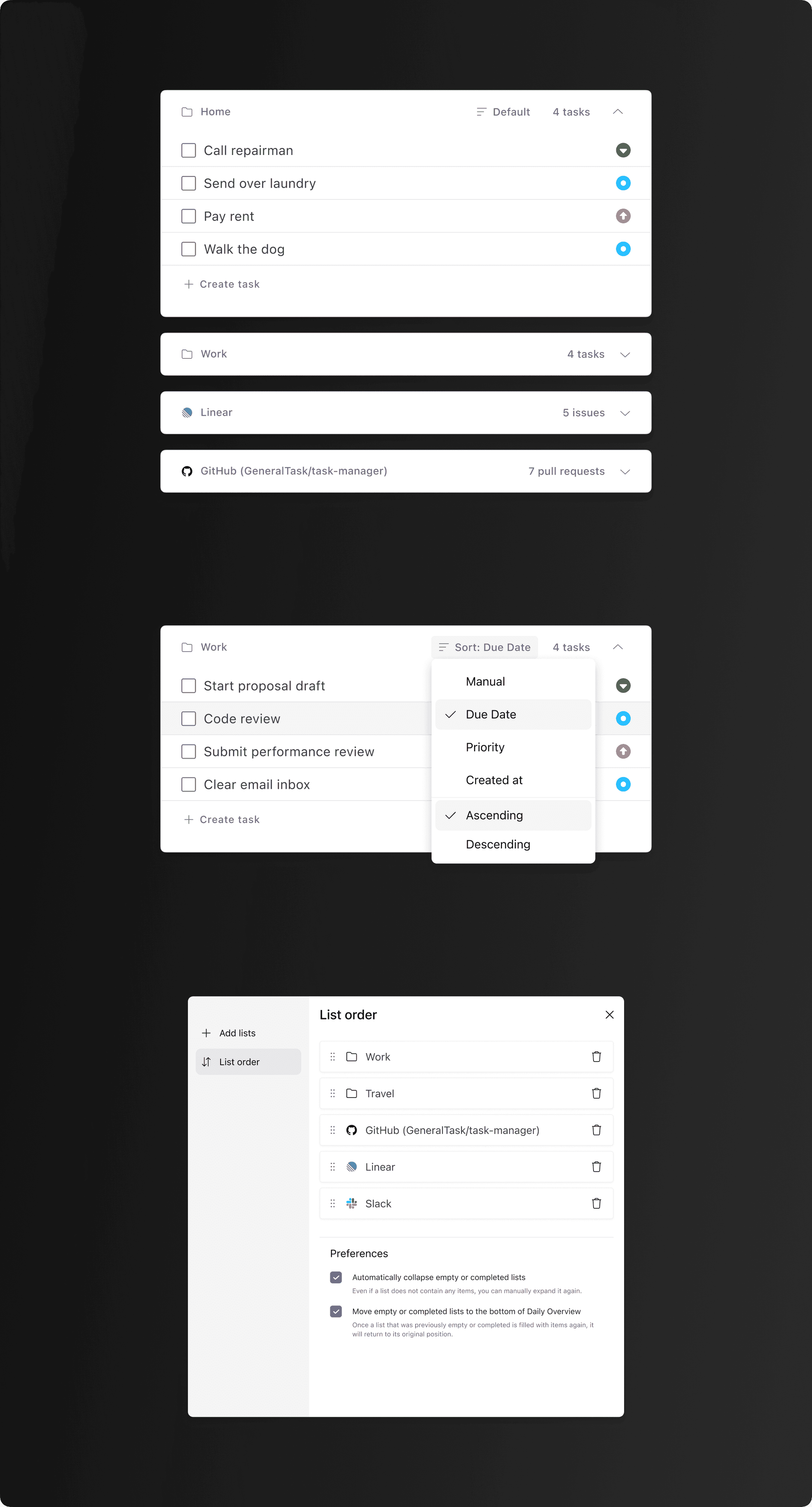
I designed a modular system of "folders" that could be arranged to the according to user preference.

Within each folder were extensive sorting options.
Context & Problem
While developing an initial prototype of our web-based task management tool, early feedback from users indicated that the homepage did not yet resonate with our target audience, software engineers, and lacked compelling advantages over existing productivity solutions in the market.
Additionally, there had been no formal user research conducted to guide our product's development. This lack of differentiation and user-centric design approach hampered our ability to effectively address the specific needs and preferences of software engineers, thereby limiting product appeal and usability.
Goals
magnifying-glass
To identify and address the productivity pain points of Software Engineers.
laptop
Tailor our product to meet the needs of Software Engineers.
expand
Design a scalable productivity system that grows with our product.
Discovery and ideation
I led a cross-functional workshop to generate and gather ideas from the team, allowing everyone to be a contributor early in the design process. Additionally, I was able to gather the experiences of my engineering colleagues to inform product direction and align on technical feasibility.
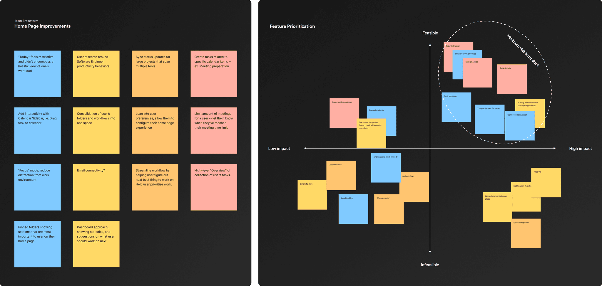
User research
We started conversations with 20+ IC Software Engineers, Engineering Managers, and founders. The essential question we wanted to answer: what gets in the way of one's ideal workday?
I worked with my founder to draft a research script, leaning into questions that were open-ended, evoked honesty and detail in order to get a comprehensive look into our interviewee's work habits and pain points.

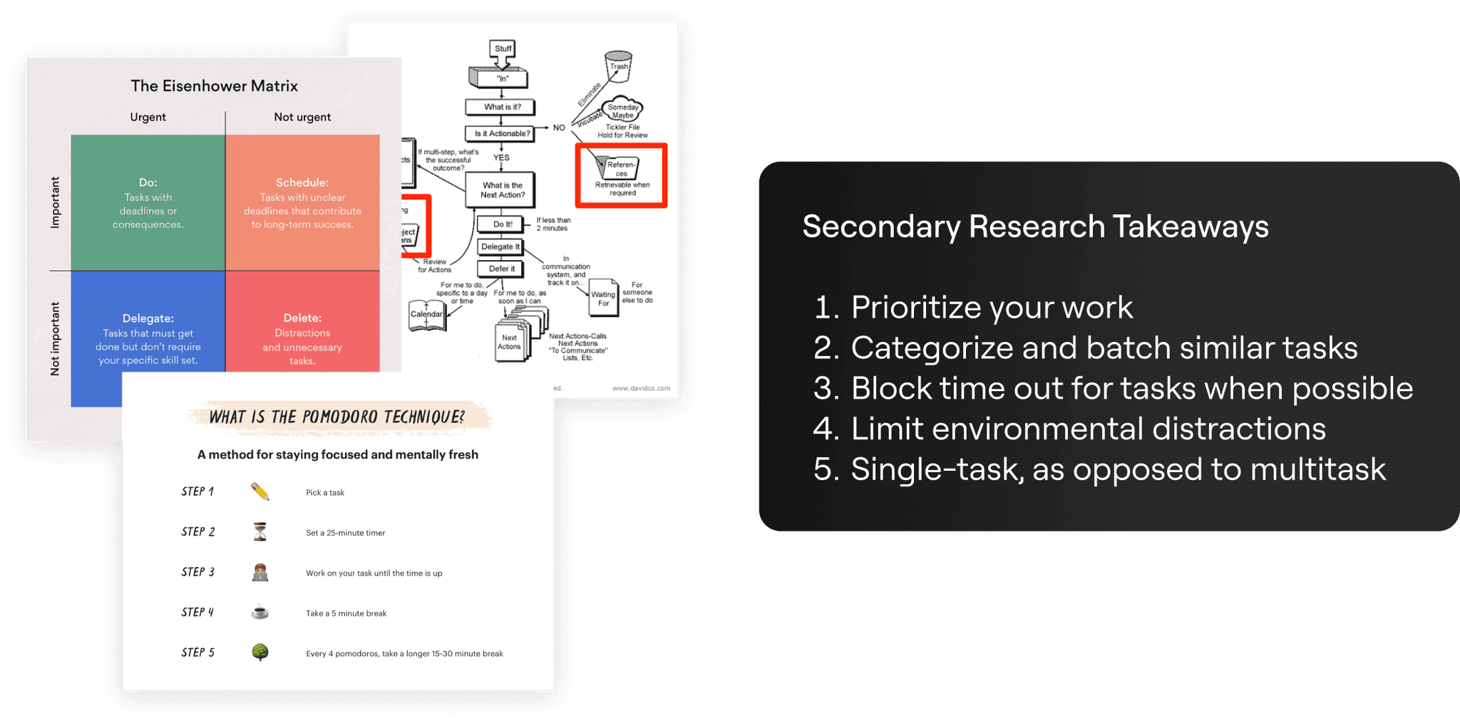
Research highlights
tag
Engineers lack a singular source of truth for project status updates.
Therefore, Engineers needed a single source of truth for their work.
list
Engineers are struggling with prioritization.
Engineers need an effective way to prioritize their many tasks spanning several projects in order to quickly decide what to work on next.
briefcase
Engineers had varying work styles.
Engineers need a task management system that is attuned to their unique preferences.
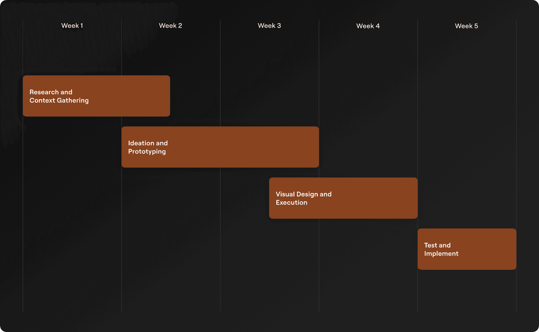
Sketches
I started off the iteration process by creating paper sketches, which helped me visualize and explore potential solutions. These were the early drafts which informed the structure of our MVP design.
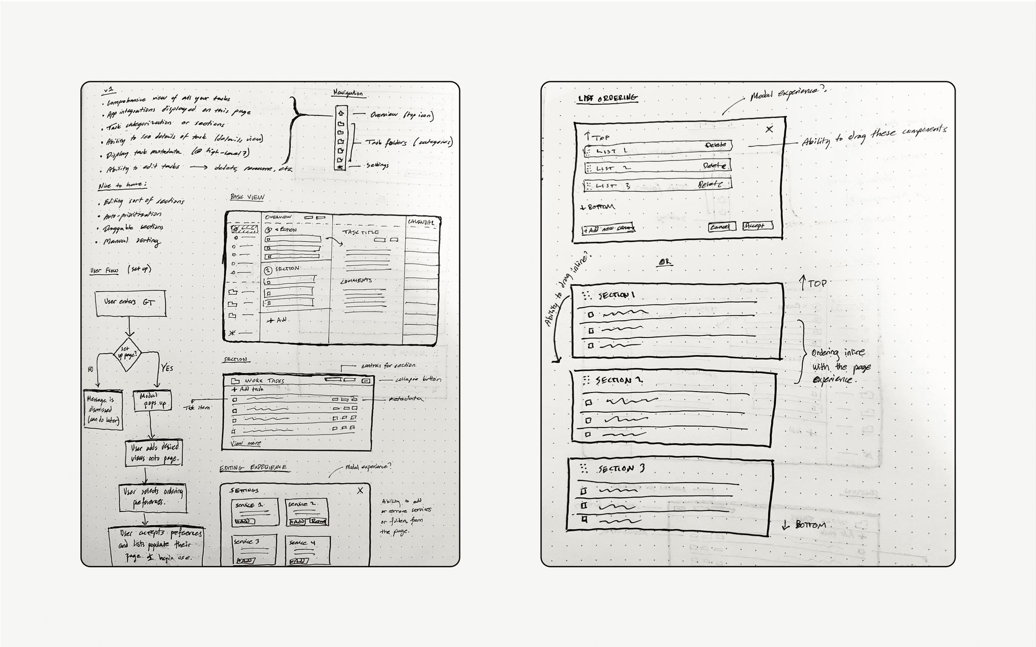
Wireframes: Folders
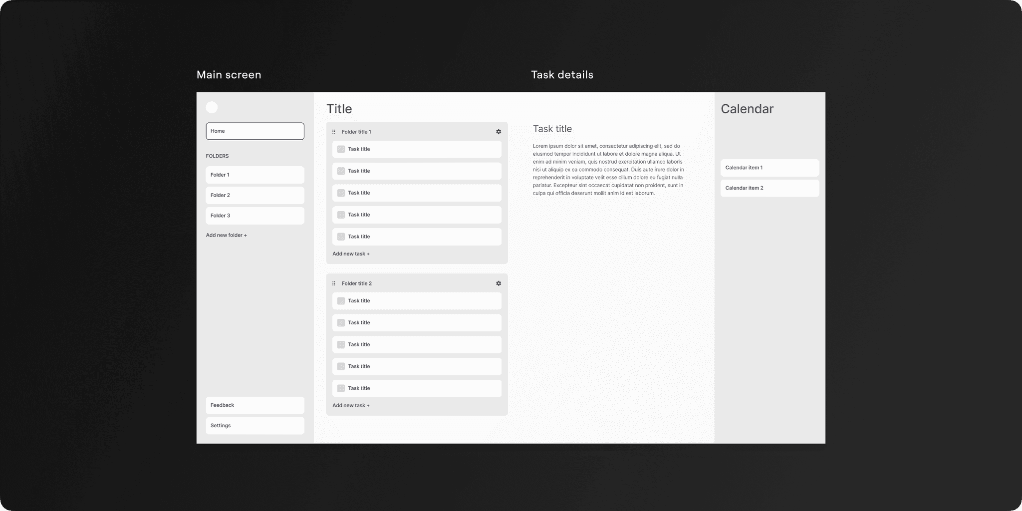
Utilizing our existing folder system for developer efficiency, I introduced a new card component. Since users required a clear view of their tasks and their context, this modular container is adaptable to user's viewing preferences and shows the associated folder. I crafted this card component with a straightforward design pattern, addressing edge scenarios like empty and overflow states.

Wireframes: Home Page Layout
I initially designed a dashboard grid layout displaying task folders. Clicking a task opened its details in a modal, which users found disruptive due to its lack of detail.
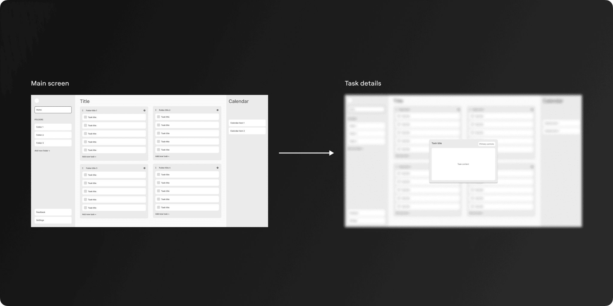
I then experimented with a multi-column layout where task details were on a separate page, but feedback indicated it resembled a Kanban board, which wasn't our goal.

Ultimately, a two-column design was chosen, stacking folders vertically in one column with their details in the second. This encouraged a prioritized, streamlined approach to tasks, resonating best with user feedback.
Visual Design
After distilling the direction of our home page layout, I moved into a high fidelity stage, adding more visual and interaction details. I presented these designs at numerous critique sessions and distilled feedback from my team.
Final Designs
During handoff, I ensured implementation was smooth for our engineers by creating detailed documentation and working closely with them during the process. The features of the Home page were shipped iteratively of, and ultimately led us to our product's public beta launch, leading us to become the #2 Product of the Week on Product Hunt, and earned us an acceptance into Y Combinator W23.

Key results
We reached our engagement goals
We saw a 1,000+ increase in user sign ups upon launch, and an 80% 30-day activated retention rate, with an increased session duration of 15%. Feedback from users indicated that the feature was intuitive and useful, helping them to more effectively prioritize and focus on their work, which validated our approach.
We were ranked a top product on Product Hunt
The Overview page was released as a part of a major feature set for our beta launch on Product Hunt, where we were ranked #2 Product of the Week. The launch was met with overwhelming positive reviews and feedback regarding our work.
We were accepted into Y Combinator (W23)
Although we ultimately declined Y Combinator's offer, building a product that industry experts believed in was huge validation for all our hard work.
Lessons and Takeaways
Focus on Viability
Working at an early stage startup meant working with very limited resources and time. It's easy to get lost in all of the possibilities, but when time is limited, we needed to hone in on solutions that were most likely to yield impact and the most viable to implement. We built upon our prototype to yield developement feasibility.
Usability Testing
Due to constraints, we lacked formal usability testing prior to shipping the Overview page. In the future would've liked to go through more tests with users in order to fully validate its effectiveness.
Establishing a Design Culture
Because this was one of my first major projects at General Task, I was simultaneously setting a precedent for the design culture at General Task. This meant refining our design process, engaging with developers to establish trust, educating colleagues, and setting up feedback, critique, and planning sessions.