
Company
General Task
Role
Sr. Product Designer
Duration
3 months
Disciplines
Business goal
To streamline and improve the product development cycle in order to ship features at a higher quality bar and with minimal friction.
User goal
Product designers and developers need an intuitive, consistent, and comprehensive system which accelerates the development of feature work.
My contributions
📣
Gathered feedback from
colleagues and leadership
🔬
Conducted a full
product audit
🗓️
Facilitated and
scheduled design sprints
💻
Designed new visual language and
component library alongside my intern
🤝
Improved documentation
and handoff processes
After an intensive period of research, revision, and planning, our team launched a comprehensive overhaul of General Task's design system. Through this process we refined our design philosophy, enhanced product usability, and improve our development process, guided by the following principles:
Visual consistency and harmony
Product usability and accessibility
A strong connection to our brand and mission
We were thoughtful about aligning our new styles with our product vision, striving for visual harmony, better accessibility, and better alignment with our rebrand.
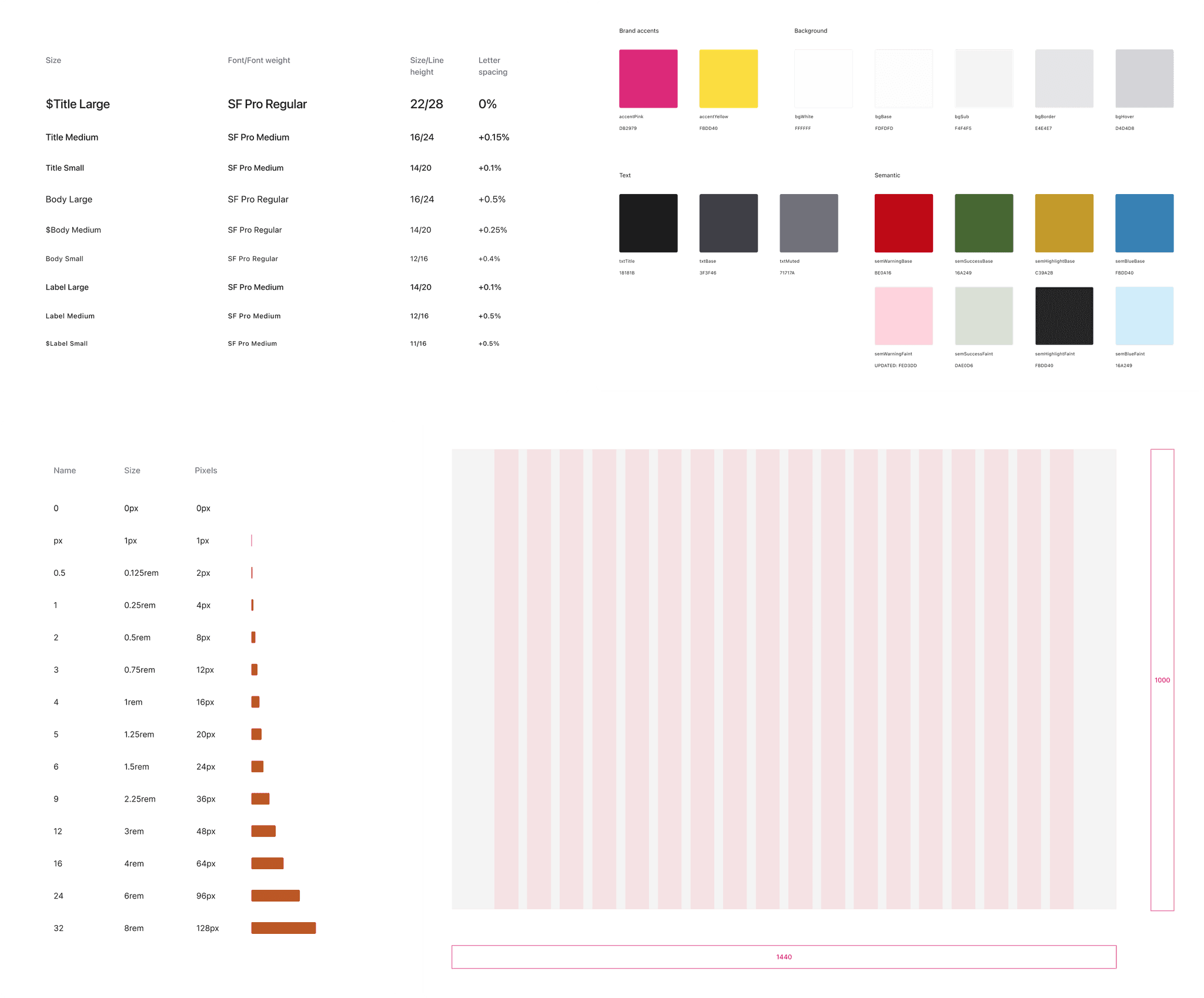
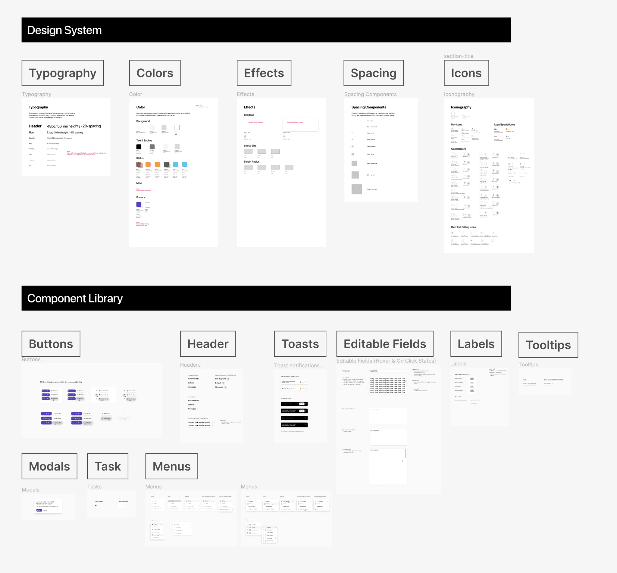
Typography. We added type styles optimized for desktop for more flexibility, old styles were amended to address accessibility issues, and naming conventions were updated.
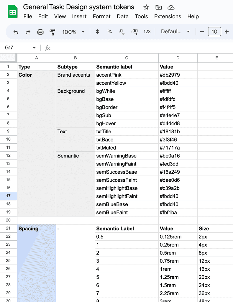
Color. Using semantic names for colors, rather than generic names or hex codes, made communication more efficient between designers, developers. We expanded our palette to accomodate our brand colors, various backgrounds, as well as semantic colors to indicate status.
Spacing and grid system. Our team previously was not adhering to a pixel grid or had any spacing components. With our new spacing and grid system, we were able to deliver more robust consistency across the product.
With our new set of styles, we refined our components library with a uniformity we were previously lacking. This enhanced library sped up our design process, enabling the team to churn out iterations faster than before.
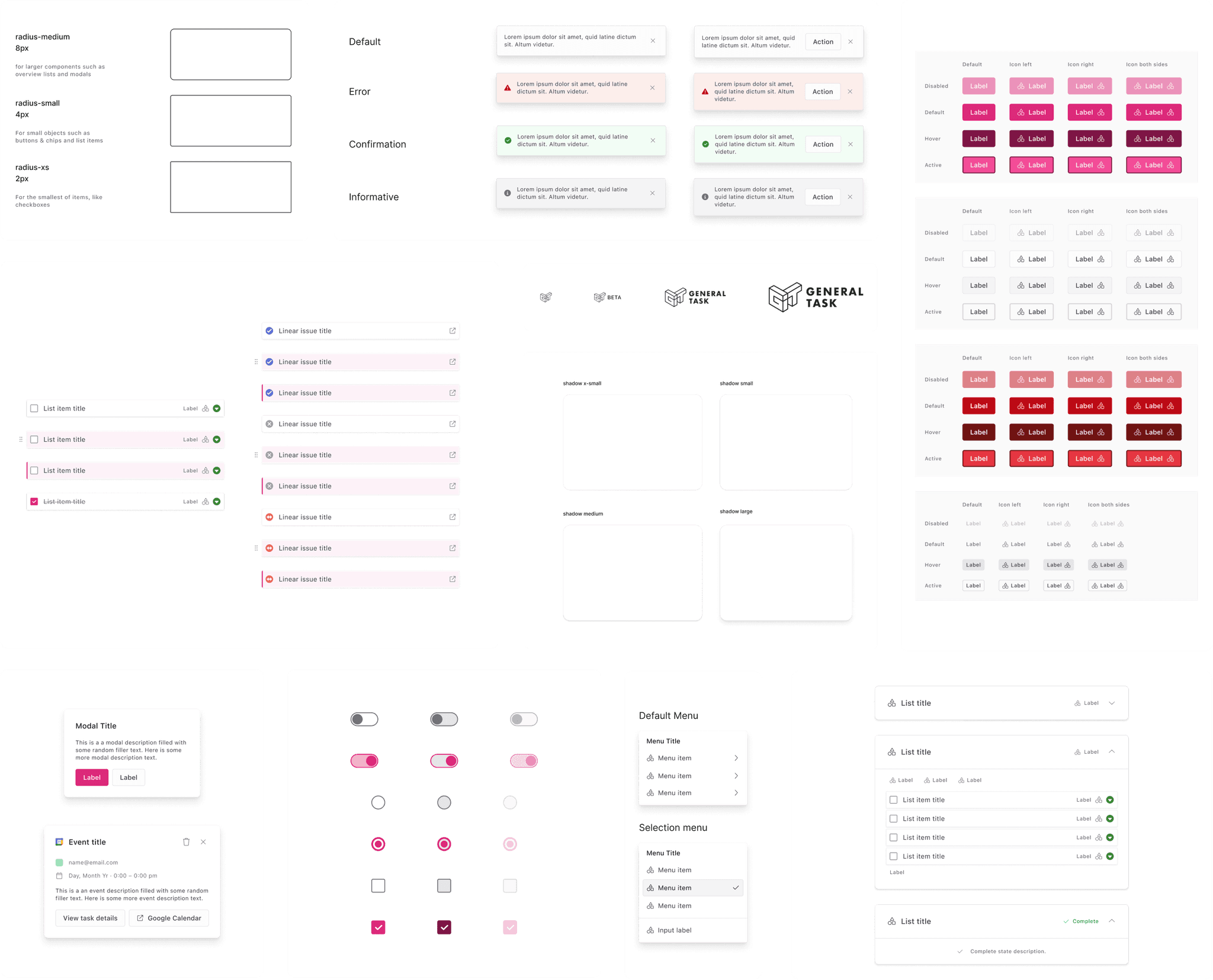
Templates. We created templates out of commonly used components, outlining use cases and sizing specifications
New components and interaction states. We accounted for error states, destructive actions, and several focus states, creating a more comprehensive library of components to account for a wider variety of use cases
Brand alignment. Our color palette and design aesthetic fit our product vision and updated brand identity
Flexibility. Leveraging Figma's capabilities, we were able to create flexible components that would allow us to efficiently create design iterations
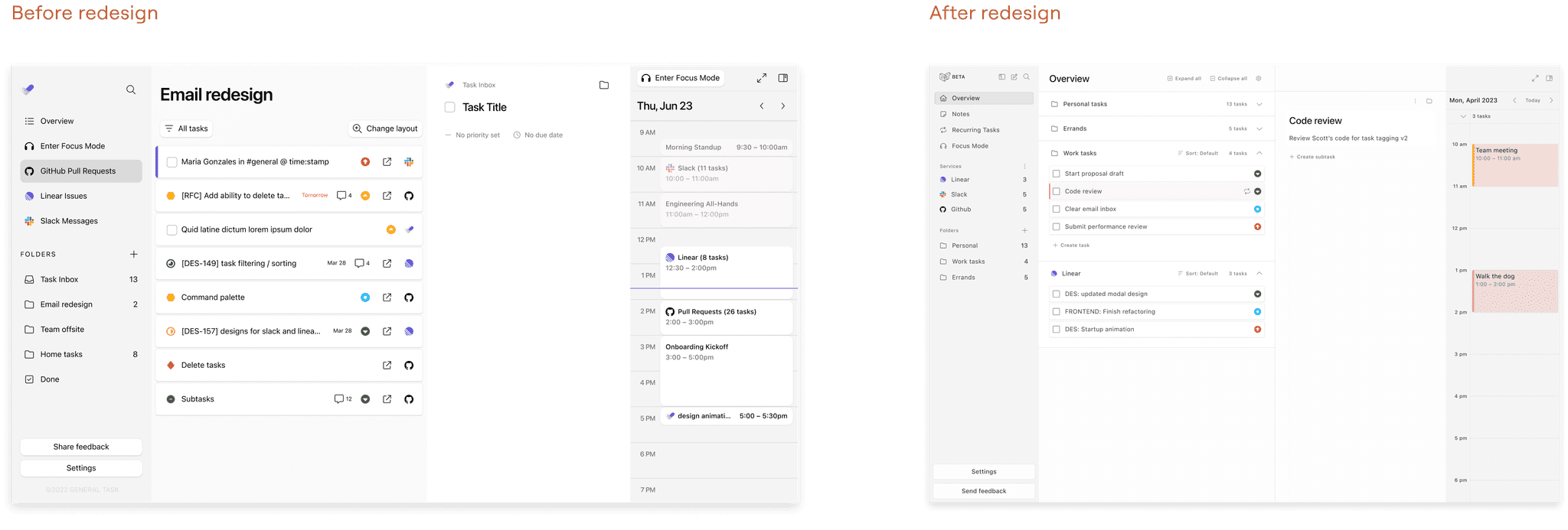
Task items were redesigned to accommodate our current and future integrations. We decreased padding for increased list item density, and moved the domino grabber outside, to avoid moving the checkbox click target.

Our updated design document was built in Figma. It gave clear instructions to the team on how to use and update our design system. We kept a change log of items whenever things changed. I received positive feedback from our developers and leadership team that the extra instruction was huge improvement from our past document which was often ambiguous and hard to navigate.

Faster design and development turnaround
We were able to streamline the design-to-development process, significantly reducing the turnaround time. This was achieved by establishing a reusable component library and predefined design patterns, which minimized the back-and-forth communication, and allowed designers and developers to focus more on innovative features and problem solving.
Shared source of truth
The new design system served as a unified source of truth, making it easier for both designers and developers to stay aligned on product specifications. By maintaining consistency in styles, components, and design principles, misinterpretations and deviations were significantly reduced
A higher level of visual polish within our components
The consistent use of typography, colors, spacing, and other design elements across all screens and features elevated the aesthetic and usability of the product
Our product suffered from inconsistencies, both visually and functionally
General Task’s UI, we were missing foundational interaction states and had inconsistent components across the app that lead to an overall clunky user experience. These were definitely red flags which decreased the quality bar of our app.
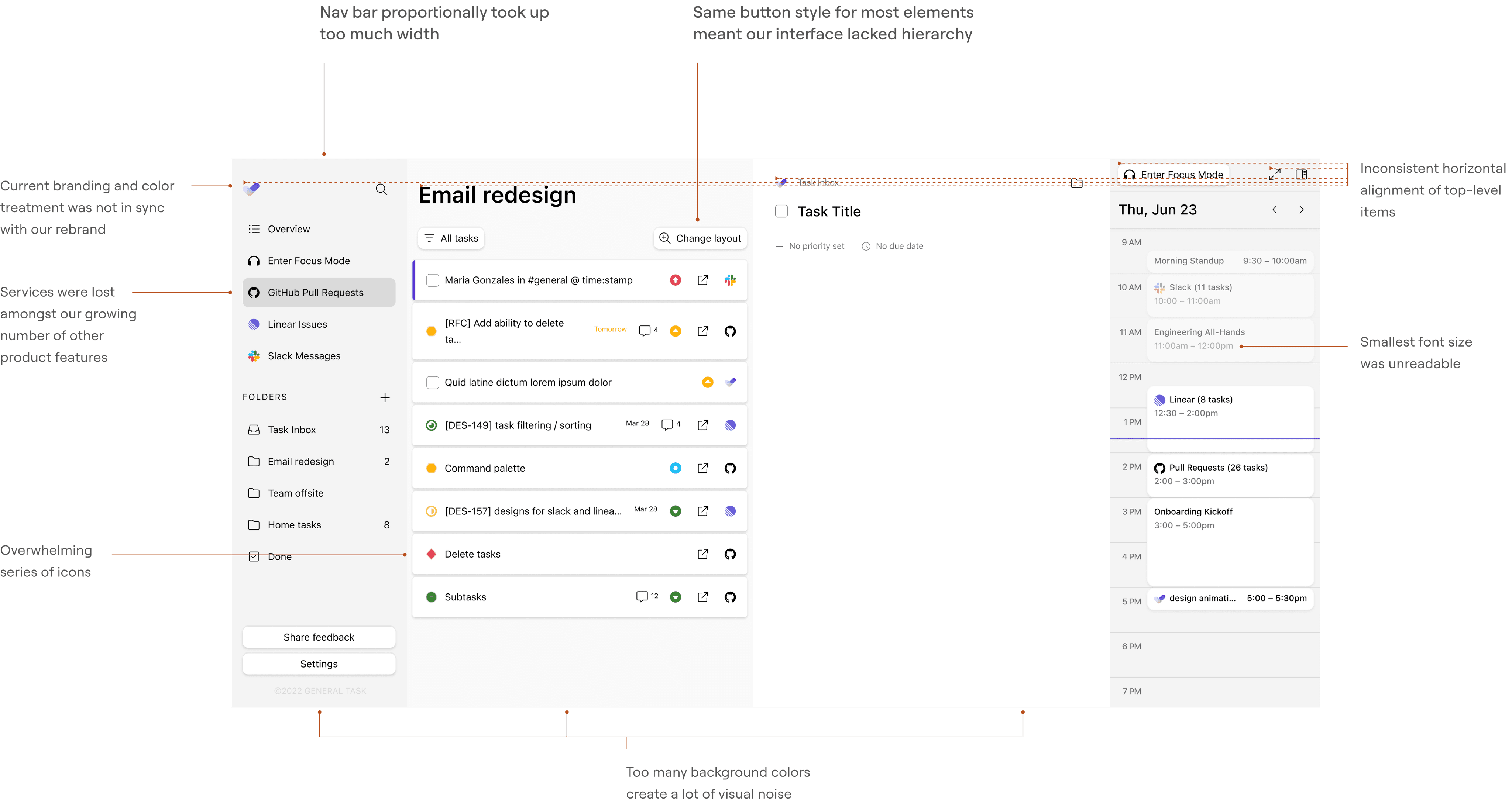
We had inadequate documentation and designer-to-developer handoff
Designer-to-developer communication was stifled by a lack of a source of truth for our designs. Oftentimes, components were created without defined spacing, color, or typographical specs, leading to inconsistency between projects. Developers were often would take matters into their own hands and design components from scratch.
It started to become obvious to us: we needed a source of truth for designers and developers. Without a fully comprehensive design system, the quality bar of our product would continue suffer as we kept building new features. After consulting with leadership, developers, and my design intern, we began to ask ourselves questions which would guide the direction of our revamped design system.
How might we improve our design foundations so that we can grow at scale?
How might we create a system more accessible to our developers?
How might we create a system that encourages more alignment between designers?
Given our status as an early-stage startup, effective resource allocation was critical. I wanted to deliver a compelling proposal to my product manager and the founders demonstrating why establishing a revamped system would be an important investment of our time. To support these discussions, I created a general timeline and outlined high-level goals to give the team a clear roadmap.

We went through a thorough audit process, analyzing our legacy design library which contained our (quite disheveled) set of product styles and components. We recorded what was missing, found opportunities for improvement, and prioritized which work was most feasible and pertinent within our timeline.
Here were some notable observations from our audit:
We were missing standardized grid system and spacing units.
We lacked some essential interaction states for a majority of our components.
We were using an outdated color system which wasn’t aligned with our recently updated branding.

I conducted a competitive analysis of popular design systems which gave us inspiration for for how we could improve our system and documentation: Google's Material Design 3, Figma's UI2, Linear's design system, and Stripe's design system.
Handing off our revamped design system was just the start of the process of an ongoing initiative. I conducted dedicated sessions to familiarize the development team with our refreshed visual language, principles, and the usage of design tokens.
We also solicited feedback for ongoing questions and continuous. Our team recognized that this was a living system which required continuous improvement to ensure it remained efficient and intuitive.

Learn fast, fail fast
Working for a early-stage startup taught me how to make the most out of limited time and resources. Since I was trusted with such a large project, and with little prior design systems experience, I had to embrace that I'd have to move quickly and make mistakes. It also showed me I can learn a lot in a short period of time.
Continuous improvement
Design systems are never finished. Although my time with General Task was nearing an end, there were a lot of moving parts within our design system that could've used improvement. We had to ensure that there was routine maintenance of our system and alignment with the team to keep everything up-to-date.
Thinking long-term can save you time in the short-term
Our investment into making a sustainable and organized system enabled us to iterate faster than we ever had before. This gave us more space to try new, creative solutions which we didn't have the bandwidth for before.
Prioritize, prioritize, prioritize
With such limited time it taught me to focus on the most impactful and foundational aspects first, allowing us to move faster through the rest of the project.