General Task
General Task
General Task
Design System Overhaul
Design System Overhaul
Design System Overhaul
Role
Design systems
Product design
Visual & interaction design
Role
Design systems
Product design
Visual & interaction design
Role
Design systems
Product design
Visual & interaction design
Team
3 engineers
1 product manager
1 product design intern
Team
3 engineers
1 product manager
1 product design intern
Team
3 engineers
1 product manager
1 product design intern

Context
Context
Context
Following a successful public launch allowed our team to think longer term. After months of hard work, my team finally launched General Task to the public. We created a web-based productivity tool geared towards software engineers that gave users a holistic view of their workload.
Following the public launch and our visual rebrand, we began to quickly acquire a large amount of new users. With new users, came a large amount of feedback on our beta product. My team had an opportunity to slow down and assess the feedback. I saw this as an opportunity to reflect on what processes and systems we could improve on as a team.
The Problem
The Problem
The Problem
Our product was suffering from functional and visual inconsistencies. Being an early stage startup, we were designing and shipping new products at a high velocity to gain traction with investors and new users. This often meant we were shipping things with inconsistencies and unaddressed edge cases — resulting in an overall clunky user experience.
To address these inconsistencies, I knew we had to step back and take a look at our existing process, component libraries, and documentation. During this audit, I realized we needed to think of longer term solutions, which started with creating stronger design foundations.
Therefore, I championed and executed a design system and visual language overhaul by securing leadership approval, facilitating design sprints, and collaborating with developers for implementation.
Proposal and Planning
Proposal and Planning
Proposal and Planning
Given our status as an early-stage startup, effective resource allocation was critical. Therefore, I needed to deliver a compelling proposal to my product manager and the founders demonstrating why establishing a revamped system would be an important investment of our time.
To support these discussions, I put together a general timeline and outlined high-level goals. Presenting these artifacts to key stakeholders allowed them to fully visualize the extent of this project.
After presenting, I quickly got buy-in that an audit and overhaul of our design system would be an important next step for the company.

Taking a stock of our existing design foundations.
Taking a stock of our existing design foundations.
Taking a stock of our existing design foundations.
In collaboration with my design intern, we went through a thorough audit to discover the existing problems of our current documentation and design libraries. Working together helped us move quickly and align on how we wanted to redefine processes moving forward.
In collaboration with my design intern, we went through a thorough audit to discover the existing problems of our current documentation and design libraries. Working together helped us move quickly and align on how we wanted to redefine processes moving forward.
In collaboration with my design intern, we went through a thorough audit to discover the existing problems of our current documentation and design libraries. Working together helped us move quickly and align on how we wanted to redefine processes moving forward.

We needed to keep in mind that we had limited time to work on this project, therefore I delegated our work so we prioritized the most feasible and foundational aspects first.
We first started analyzing our color and typography systems, and then moved into our components.
We needed to keep in mind that we had limited time to work on this project, therefore I delegated our work so we prioritized the most feasible and foundational aspects first.
We first started analyzing our color and typography systems, and then moved into our components.
We needed to keep in mind that we had limited time to work on this project, therefore I delegated our work so we prioritized the most feasible and foundational aspects first.
We first started analyzing our color and typography systems, and then moved into our components.
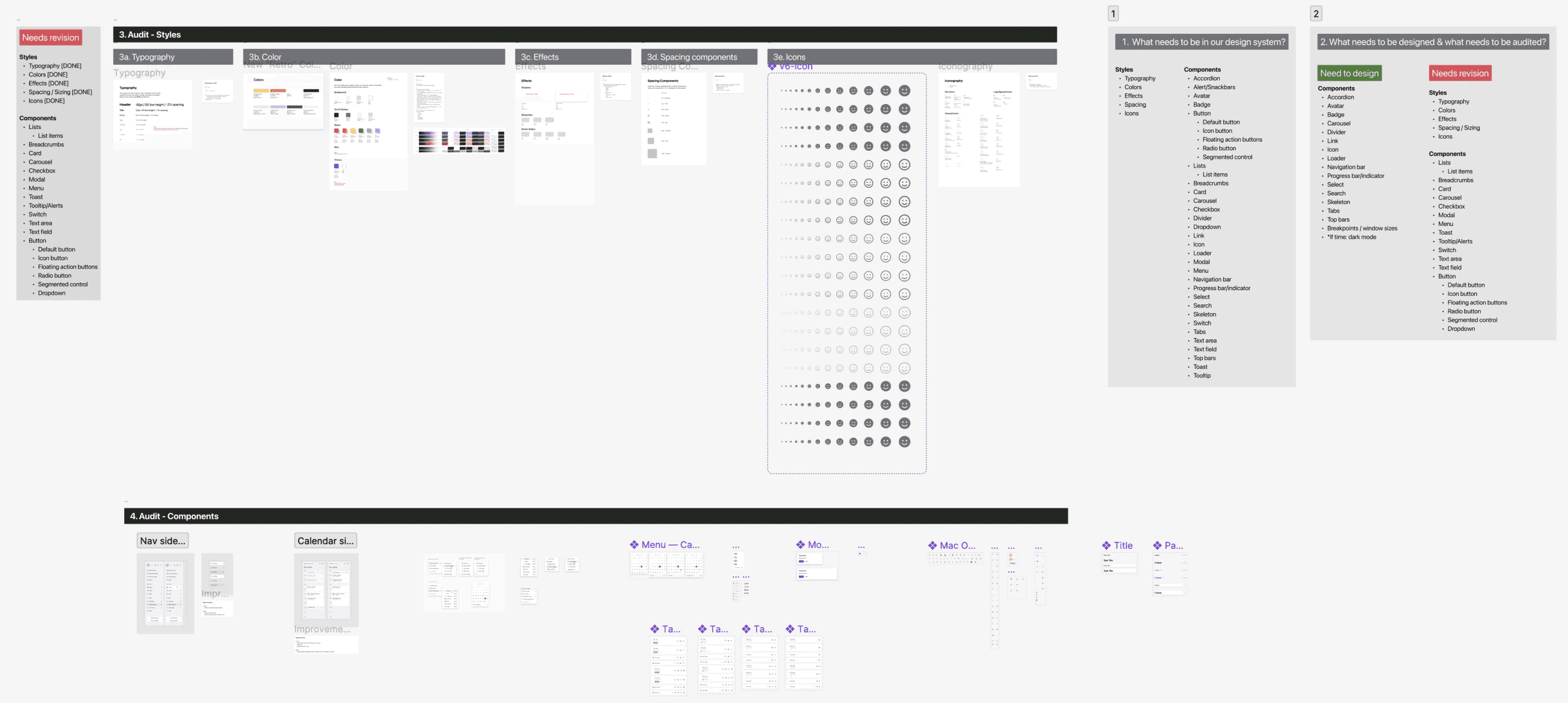
Key takeaways from our audit
Key takeaways from our audit
Key takeaways from our audit
Our documentation was inaccessible to colleagues outside of the design team. Lack of clear organization, labeling, and unclear instruction kept engineering and product management in the dark, leading to inefficient collaboration/
Our documentation was inaccessible to colleagues outside of the design team. Lack of clear organization, labeling, and unclear instruction kept engineering and product management in the dark, leading to inefficient collaboration/
Our documentation was inaccessible to colleagues outside of the design team. Lack of clear organization, labeling, and unclear instruction kept engineering and product management in the dark, leading to inefficient collaboration/
We needed to reorganize our documentation so that it was orderly, pragmatic, and accessible to our engineering and PM partners.
We needed to reorganize our documentation so that it was orderly, pragmatic, and accessible to our engineering and PM partners.
We needed to reorganize our documentation so that it was orderly, pragmatic, and accessible to our engineering and PM partners.
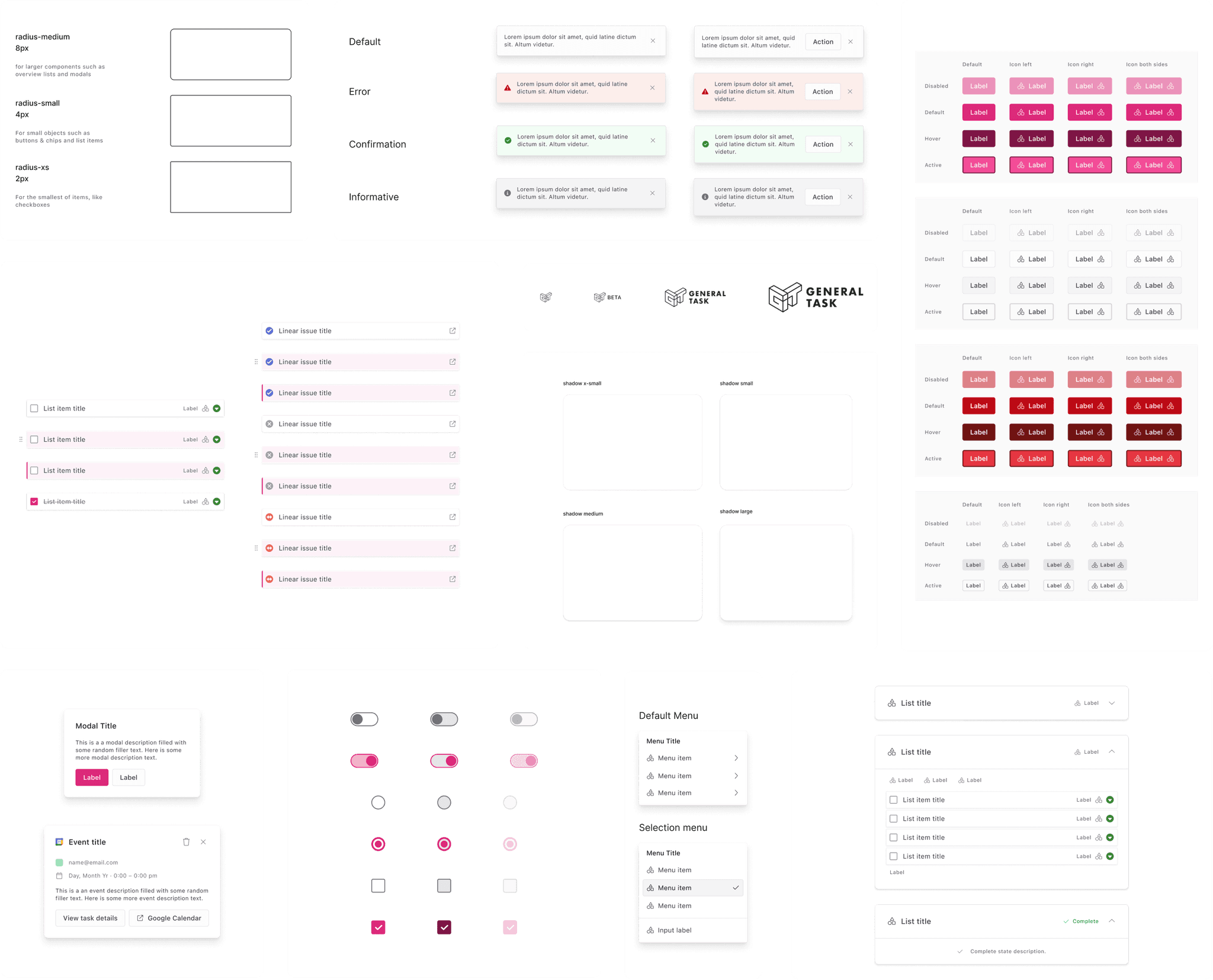
We were missing foundational components, color and effect styles, and several interaction states.
We were missing foundational components, color and effect styles, and several interaction states.
We were missing foundational components, color and effect styles, and several interaction states.
In order to make for a higher quality and robust user experience for our users, we needed to design these foundational elements for our system.
In order to make for a higher quality and robust user experience for our users, we needed to design these foundational elements for our system.
In order to make for a higher quality and robust user experience for our users, we needed to design these foundational elements for our system.
We were using an outdated styles that didn't align with our rebrand.
We were using an outdated styles that didn't align with our rebrand.
We were using an outdated styles that didn't align with our rebrand.
In order to create more alignment between our product and brand identity, we needed to update certain styles with our revamped brand.
In order to create more alignment between our product and brand identity, we needed to update certain styles with our revamped brand.
In order to create more alignment between our product and brand identity, we needed to update certain styles with our revamped brand.
Competitive analysis
I dove into existing and successful design system examples. By conducting a competitive analysis, I was able to pick up on industry standard practices and inspiration on how to successfully revamp our own system. I took a gander at systems such as Google's Material Design 3, Figma's UI2, Linear's design system, and Stripe's design system.
I dove into existing and successful design system examples. By conducting a competitive analysis, I was able to pick up on industry standard practices and inspiration on how to successfully revamp our own system. I took a gander at systems such as Google's Material Design 3, Figma's UI2, Linear's design system, and Stripe's design system.
I dove into existing and successful design system examples. By conducting a competitive analysis, I was able to pick up on industry standard practices and inspiration on how to successfully revamp our own system. I took a gander at systems such as Google's Material Design 3, Figma's UI2, Linear's design system, and Stripe's design system.


Workshopping our plan
I presented our findings from our audit with my product manager. After these discussions, we got more specific about the scope this project and scheduled it into our existing sprint schedule. This ensured that this work was a priority for design and engineering, as well as help the team stay organized and on track. Next we dove into the development process…
I presented our findings from our audit with my product manager. After these discussions, we got more specific about the scope this project and scheduled it into our existing sprint schedule. This ensured that this work was a priority for design and engineering, as well as help the team stay organized and on track. Next we dove into the development process…
I presented our findings from our audit with my product manager. After these discussions, we got more specific about the scope this project and scheduled it into our existing sprint schedule. This ensured that this work was a priority for design and engineering, as well as help the team stay organized and on track. Next we dove into the development process…
My PM and I refined our plan to keep the following in mind…
That this system would be more accessible to engineering for more seamless developer handoff.
That this system created higher alignment between designers
That this system could be easily adopted by future designers and other employees.
That our new system would better align with our recent visual rebrand.
Development
Getting our hands dirty with the design system.
Getting our hands dirty with the design system.
Getting our hands dirty with the design system.
After delegating work between my intern and I, we were able to tackle different aspects of our new design system. Because there were plenty of moving parts, we maintained constant communication and had multiple check-ins to ensure we stayed on the same page.
After delegating work between my intern and I, we were able to tackle different aspects of our new design system. Because there were plenty of moving parts, we maintained constant communication and had multiple check-ins to ensure we stayed on the same page.
After delegating work between my intern and I, we were able to tackle different aspects of our new design system. Because there were plenty of moving parts, we maintained constant communication and had multiple check-ins to ensure we stayed on the same page.
Color system
Our old color system was pretty inflexible, and didn't match all the use cases we required when building out certain features within our app. In order to make it more robust, we strayed away from having single color swatches for each color, and developed tonal palettes for each major color style. This range of raw colors allowed us to have a variety of colors to choose from that would allow our team to be flexible in our color choices when designing.
Our old color system was pretty inflexible, and didn't match all the use cases we required when building out certain features within our app. In order to make it more robust, we strayed away from having single color swatches for each color, and developed tonal palettes for each major color style. This range of raw colors allowed us to have a variety of colors to choose from that would allow our team to be flexible in our color choices when designing.
Our old color system was pretty inflexible, and didn't match all the use cases we required when building out certain features within our app. In order to make it more robust, we strayed away from having single color swatches for each color, and developed tonal palettes for each major color style. This range of raw colors allowed us to have a variety of colors to choose from that would allow our team to be flexible in our color choices when designing.
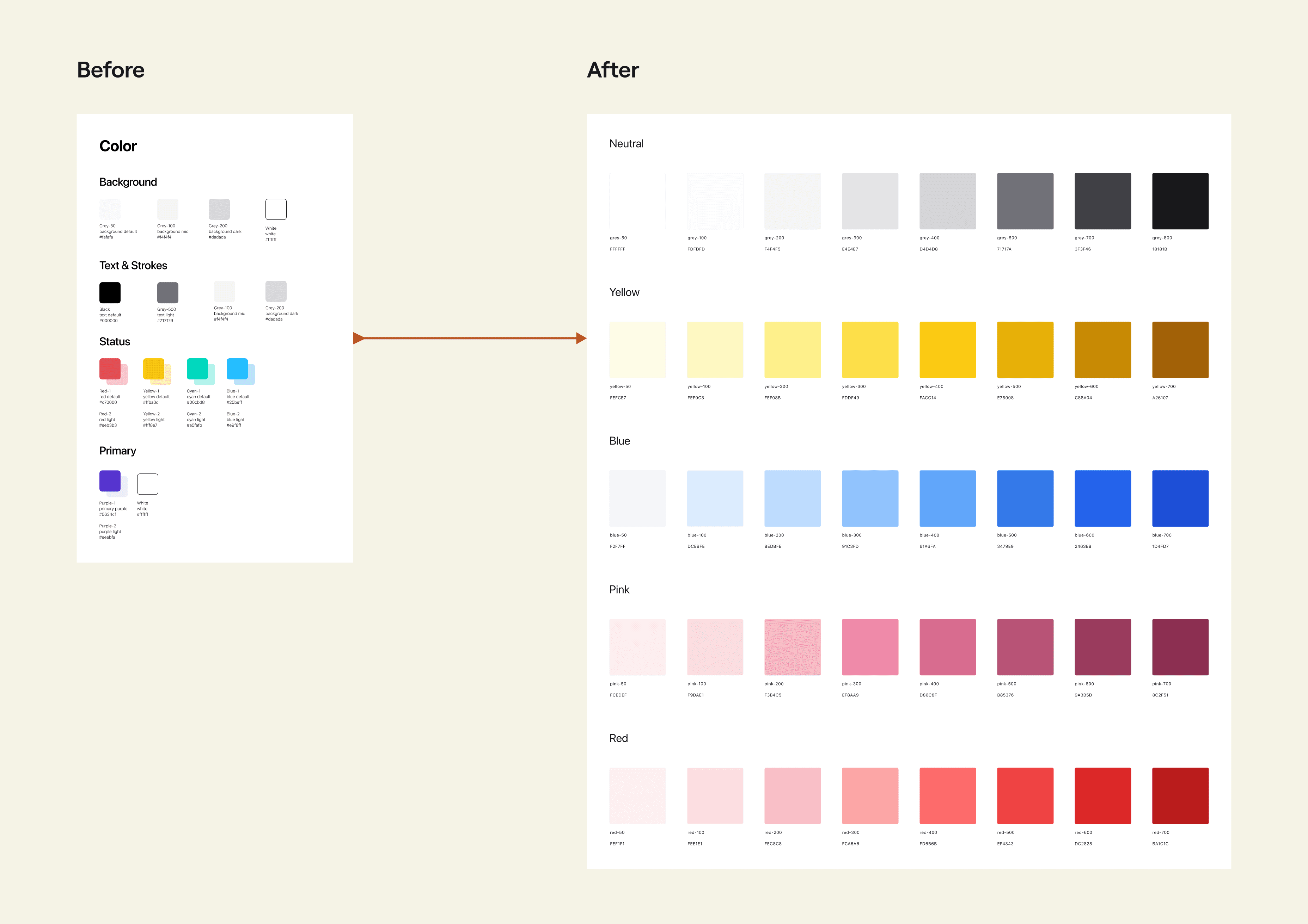
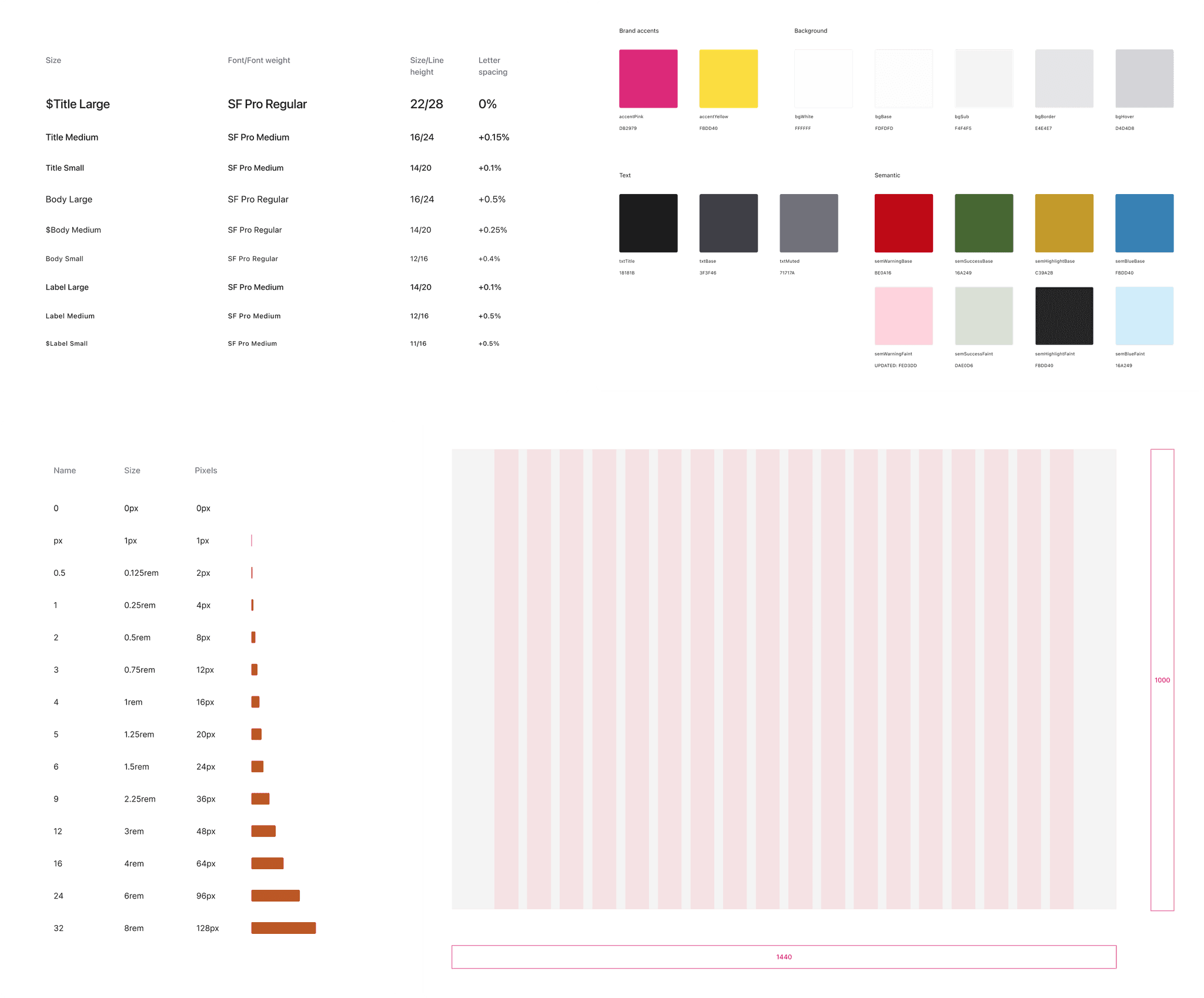
Next, we mapped out use cases for each color values within a given tonal palette. We displayed raw hexcodes and how they translated into a semantic style that existed within our components. The process of mapping this out allowed developers to easily understand which styles were used for which components. [edit pls]
Next, we mapped out use cases for each color values within a given tonal palette. We displayed raw hexcodes and how they translated into a semantic style that existed within our components. The process of mapping this out allowed developers to easily understand which styles were used for which components. [edit pls]
Next, we mapped out use cases for each color values within a given tonal palette. We displayed raw hexcodes and how they translated into a semantic style that existed within our components. The process of mapping this out allowed developers to easily understand which styles were used for which components. [edit pls]

Typography
We updated our type system so that it was more robust and encompassed specific use cases that we previously were lacking. We also altered some of our existing styles so that they were more accessible for visually impaired users.
We updated our type system so that it was more robust and encompassed specific use cases that we previously were lacking. We also altered some of our existing styles so that they were more accessible for visually impaired users.
We updated our type system so that it was more robust and encompassed specific use cases that we previously were lacking. We also altered some of our existing styles so that they were more accessible for visually impaired users.

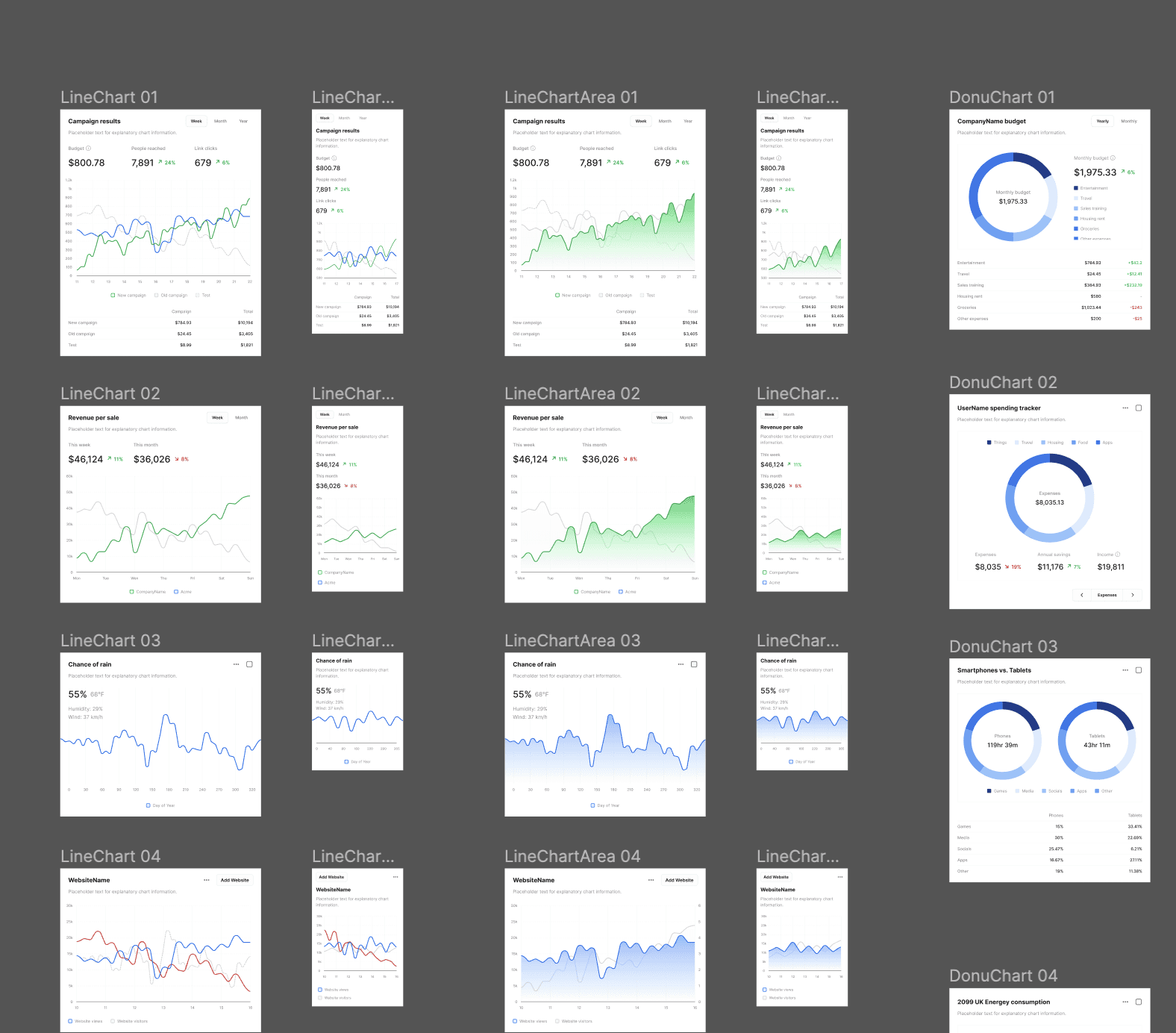
Modular components
Leveraging Figma's capabilities, we created components with variable properties so that we could easily edit certain components for specific use cases.
Leveraging Figma's capabilities, we created components with variable properties so that we could easily edit certain components for specific use cases.
Leveraging Figma's capabilities, we created components with variable properties so that we could easily edit certain components for specific use cases.

Final Results
A revamped design system and visual language.
A revamped design system and visual language.
A revamped design system and visual language.
After an intensive period of research, revision, and planning, our team launched a comprehensive overhaul of General Task's design system. Through this process we refined our design philosophy, enhanced product usability, and improve our development process, guided by the following principles:
Visual consistency and harmony
Product usability and accessibility
A strong connection to our brand and product vision

New styles
New styles
New styles
We were thoughtful about aligning our new styles with our product vision, striving for visual harmony, better accessibility, and better alignment with our rebrand. Our team previously was not adhering to a pixel grid or had any spacing components. With our new spacing and grid system, we were able to deliver more robust consistency across the product.
Updated component library
With our new set of styles, we refined our components with a uniformity we were previously lacking. This enhanced library sped up our design process, enabling the team to churn out iterations faster than before.
Templates: We created templates out of commonly used components, outlining use cases and sizing specifications
New components and interaction states: We accounted for error states, destructive actions, and several focus states, creating a more comprehensive library of components to account for a wider variety of use cases
Flexibility: Leveraging Figma's capabilities, we were able to create flexible components that would allow us to efficiently create design iterations
Applying our new styles to the product
In addition to aligning our UI styles with our visual rebrand, we aimed to increase accessibility, decrease visual noise, and optimized our components to create an overall sleek and modern interface that was intentional down to the pixel.
In addition to aligning our UI styles with our visual rebrand, we aimed to increase accessibility, decrease visual noise, and optimized our components to create an overall sleek and modern interface that was intentional down to the pixel.
In addition to aligning our UI styles with our visual rebrand, we aimed to increase accessibility, decrease visual noise, and optimized our components to create an overall sleek and modern interface that was intentional down to the pixel.

Key Results
Improved development velocity and consistency.
Improved development velocity and consistency.
Improved development velocity and consistency.
Faster design and development turnaround.
We were able to streamline the design-to-development process, significantly reducing the turnaround time. This was achieved by establishing a reusable component library and predefined design patterns, which minimized the back-and-forth communication, and allowed designers and developers to focus more on innovative features and problem solving.
Shared source of truth.
The new design system served as a unified source of truth, making it easier for both designers and developers to stay aligned on product specifications. Prior to this revamp, components were scattered across different documents that were often unorganized and inaccessible. By maintaining consistency in styles, components, and design principles, misinterpretations and deviations were significantly reduced.
Lessons and Takeaways
Design systems are an ever-changing and evolving document.
Design systems are an ever-changing and evolving document.
Design systems are an ever-changing and evolving document.
Prioritize, prioritize, prioritize
Working for a early-stage startup taught me how to make the most out of limited time and resources. Since I was trusted with such a large project, and with little prior design systems experience, I had to embrace that I'd have to move quickly and make mistakes. With such limited time it taught me to focus on the most impactful and foundational aspects first, allowing us to move faster through the rest of the project.
Continuous improvement
Design is never finished. The same applies to design systems. Although my time with General Task was nearing an end, there were a lot of moving parts within our design system that could've used improvement. We had to ensure that there was routine maintenance of our system and alignment with the team to keep everything up-to-date.
Thinking long-term, can save you time in the short-term
Our investment into making a sustainable and organized system enabled us to iterate faster than we ever had before. This gave us more space to try new, creative solutions which we didn't have the bandwidth for before.
Get in touch arrow-down-right
envelope
marcogsevilla@gmail.com
briefcase
Get in touch arrow-down-right
envelope
marcogsevilla@gmail.com
briefcase
Get in touch arrow-down-right
envelope
marcogsevilla@gmail.com
briefcase